Posted on 8th January 2026
by Jacqui Vear
As we head into 2026, Systematic enters a new chapter. With our 50-year trading anniversary behind us, its onwards and upwards, with time to move on from the gold embellished logo that defined our magical, award-winning year.
Perhaps! That’s the joy of having oodle in the room, (and they can certainly be in your office, or in your calls too). Taking time for creative thinking is never time wasted. Creative briefs don’t need to be fully formed from the outset – the strongest ones rarely are. They evolve through structured discussion, reflection, confident projection and a clear check-in with values.
Evolution is the key word here. A rebrand doesn’t always mean out with the old, in with the new. For businesses that are established and recognised for what they do well, that approach can be counterproductive.
But brands can, and should, change. The challenge is to hold on to what matters most, while introducing the right level of newness. Done well, this gives you renewed energy, clarity and confidence when communicating what your business stands for.
That’s exactly what this process gave us through oodle.
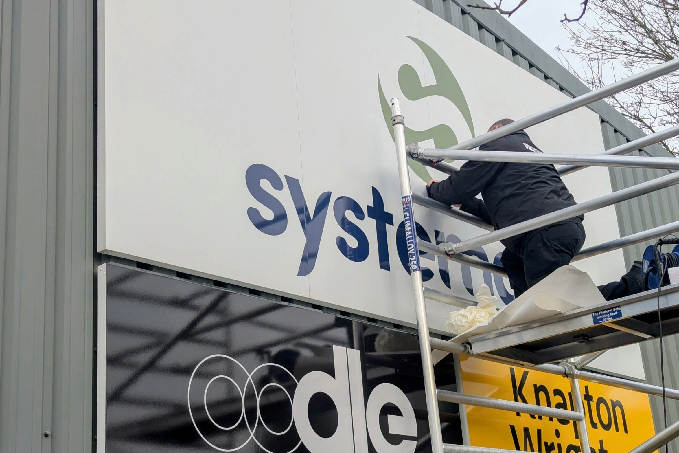
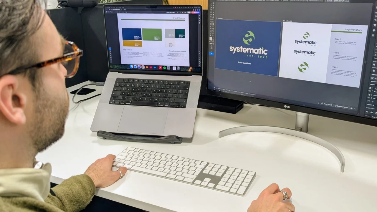
Blue and green have long been part of our visual identity, and that hasn’t changed. What has evolved is our green hue – now more earthy and muted in Pantone 576C. It feels natural and understated, without losing its distinctiveness or memorability.
Our unique font remains the same. We built it in 2021 on strong foundations and still believe it is simple, confident and effective. What we have added is a small but meaningful detail: est. 1975. Our history matters to us. It reflects five decades of adapting, evolving and responding to the changing needs of the businesses we support.
This isn’t a reinvention – it’s a refinement. A tweak that feels true to who we are and where we’re heading. We hope you like it!
A strong brand is more than a single logo – it doesn’t exist in isolation. It’s a living, communicative entity, experienced across multiple touchpoints. That means it needs adaptable accessories that complement its core identity: colour schemes, icons, imagery, and other visual elements, all brought together in clear, practical brand guidelines. These ensure that everyone, and every piece of marketing, works in harmony.
For Systematic, we’ve made a few tweaks and embellishments that aren’t just aimed at changing how our brand looks – they’re designed to enhance how it’s experienced.
We’re in a new year, don’t just press repeat – press pause. Take time to assess where your brand is today. Even if you conclude that your current identity is working at its best, the process of validation brings clarity and focus.
And if, like us, you decide it’s time for a brand tweak, with a look you can grow into, go for it. oodle is here to help. Reach out for a conversation with an open mind and explore ideas that could give your brand a fresh spring in its step for 2026.