Posted on 1st December 2021
by Jacqui Vear
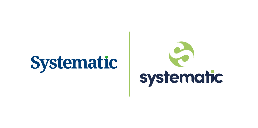
We’re the Systematic you know and rely on, yet you might have noticed that we’re looking a bit different? Our Graphic and Digital Designers have applied their creativity to our new brand design.
We posted an article back in May, 10 top tips for rebranding in the ‘new normal’ and maybe that subliminally started the ball rolling! We’re now looking ahead to what will be 50 years in business before we know it, we’ve invested in more creative capacity and energy within our Design Studio and we’re ready to take our mission to help you win business and do business onwards and upwards!
Paige Gregory, our talented Digital Designer, has animated the reveal of our new brand design:
Our brand continues to reflect the blue and green colours many of our contacts identify with. These colours connect us to nature; with Systematic HQ being in an AONB within the Lincolnshire Wolds, also to the sustainable and renewable materials that we apply to your projects. They are colours reflected within the Lincolnshire flag too!
We found our type! ‘Systematic’ is presented as a bespoke font, to make the heart of our brand collateral unique and bespoke to us.
Our lowercase letters hopefully reinforce that we’re approachable. Our sans serif font is tidy, modern, and accessible! It has a rounded feel and is designed to flow, like the collaborative long-term relationships that we look to nurture with our clients. There’s an element of decoration, as we’ve maintained our green dot. This feature has come to represent our commitment to sustainable business in even the smallest of details, as we ‘dot the i’s’.
An ‘S’ icon is central to our brand. Icons are great visual communicators, especially as we are all communicating quicker and across more channels than ever before. We knew it would have the power to sustain our identity across web and social platforms.
As our brand icon ideas evolved, we were creating an image that we identified with as a globe and an infinity symbol, themes that resonated with our values. We create links with your teams and skills, forging a strong chain of support, which can take the form of many types of creative project.
So that’s the short-hand version of the thought and creativity that was invested in our brand redesign. It’s given our team a renewed sense of identity, purpose and reaffirmed our future aspirations. Brand design is powerful, within an organisation and beyond it. We’d be delighted to reflect your journey in a visual identity too, whether for a new brand or a rebrand. Get in touch for a chat.